TL;DR: 16px minimum font-size for body text, 1.5em line-height for said text; max width should be 60-80 characters == 27-35em.
I'm calling you out. All of you. The hackers, the designers, the code monkeys, the word-smiths, the editors, the CSS gurus, and everyone else who works on content management systems and style sheets for news sites. Stop using small font sizes.
Nearly every site has an app these days (or can be consumed through Google Currents/Reader/etc), so for those of us with physically large screens, please optimize your site's content for a real viewing distance. If you're expecting your readers to consume the content, and it's not just there to be slathered in ads and tracking beacons, please don't use any less than a 16px base font-size for body content text.
An even better idea is not to set that at all, as most browsers default to 16px these days. Another wonderful thing to do (rules of thumb, ymmv) is to set the line-height on that body text to ~1.5em of your content's font-size. Also, if you've got more than 90 characters to a line, you probably have too many characters on that line. The target is around 60 characters (~27em) wide. I personally like it wider (which is why mine is 35em or ~83 chars). If you go much wider, your readers can get (essentially) reading fatigue. It's hard to find the next line to read if your lines are too long; too short and your reader's eyes reset to a new line too frequently and they can't focus on processing the information.
Another issue is that HD size wide screens are becoming quite common. On an HD screen, reading your 10pt Times New Roman or Arial is like trying to see bacteria with an unaided eye.
Ordinarily I only complain (seriously, I send emails and tweet) about this to longform journalism sites, but even the silly little 2 paragraph ad-slathered articles about which famous person did what benefit greatly from these changes.
And, for sure, evaluate the changes yourself. Dig into Inspector or Firebug and start changing your CSS. A useful habit is to stare out the window for 10 seconds after you've made the changes before you try to re-read the text. It lets your eyes refocus, otherwise you'll probably initially hate the changes you're making because it looks weird. Don't fret, it grows on you. It feels better.
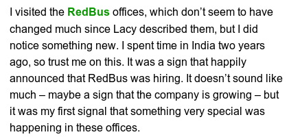
Perfect examples:
(links to articles)
- The Atlantic
- TechCrunch
- ASPI Strategist
- Phoronix
- Silicon Prairie News
- The Nation
- Wired
- Courant
- Public Intelligence
- Al Jazeera
I'll bet some reactions will be "but it's okaaaaaay~". And you're right. Some of the small text is okay. But it is not making anyone jump with joy to read your articles or consume your celebrity gossip. So little work is required to make this a reality, and the benefits to all online publishers are so great.
Note: this rant also applies to every other site where people consume your content. If you're using anything under 14px font, you're bad and you should feel bad. Seriously though, use 16px+.
Examples
As requested on HackerNews:
The ONLY changes I made was font for the body to 16px and line-height to 1.5em.
The Atlantic
before
after
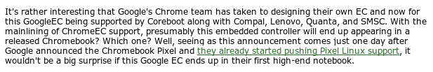
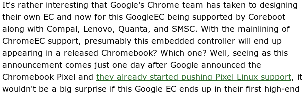
TechCrunch
before
after
Phoronix
before
after
PubIntel
before
after
Wired
before
after